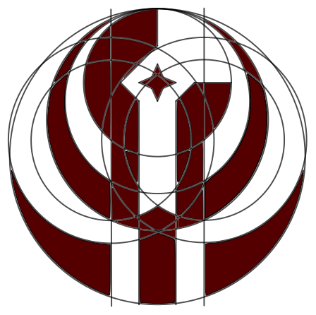
I have been using the symbol for the Old Republic from Star Wars as my goto profile picture for quite sometime. In my attempt to maintain a consistent social network profile over multiple websites, I gradually come to realize that profile picture is the most intuitive way to establish a identity (I guess this is also why services like Gravatar would be so popular exist ). In this case, using a picture from Wookiepedia that everyone has access to is probably not the brightest idea. Thus, I set out to create my very own avatar icon thingy.
Since I don't consider myself to have even the least amount of artistic talent, I started out spending quite some time in GeoGebra trying to reconstruct the Old Republic symbol in a systematic way. Filling up my screen with circles and measurements is fun and surprisingly addicting, yet after several hours, I only ended up with a confusing hodgepodge of curves.

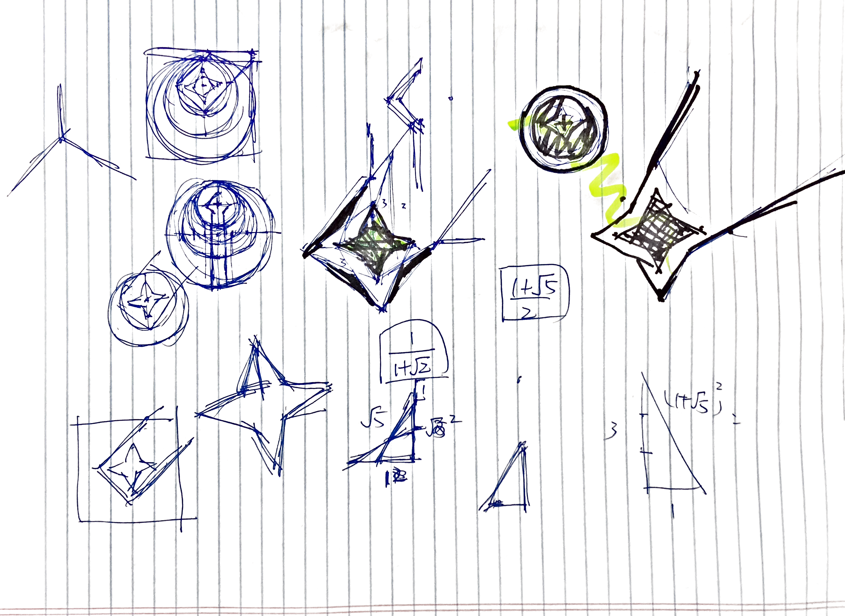
It is obvious at that point that I won't be able to recreate anything nearly as complicated as the Old Republic symbol, so I started stripping out a more abstract version of it.

I isolated out the "rising star" part of the original logo and discarded the wing-shaped portions to center the star. Instead of a rising star, I went for the impression of a shooting star and it turned out extremely well (in my opinion at least). With delight, I settled on the logo design a few minutes later. I kept the dark red color scheme (though I actually used #700000 instead of the original #710100 because I hate dangling ones) and added a gray background (#707070) as using white seemed too bright for me.

I also played around with several alternative color schemes, i.e. inverted versions. Maybe I will use these as icons for other projects. So far, I have updated all my actively used social network profiles and changed the favicon of this blog. Hopefully this icon would be unique enough for others to recognize me across different social networks.